“What shimmering silks, what fancy, glittering marbles, what opulent bronzes and golds… Let’s have done with it… It is time to crusade for whitewash and Diogenes.” Le Corbusier
Le Corbusier was not speaking of the ancient world, but he would no doubt have been disappointed by its colourful splendour all the same. We have long since disabused ourselves of the notion that the ancient world was pristine white. We know sculptures were bedecked in vibrant colours, buildings embellished with many-hued details, interior walls painted in a kaleidoscopic manner, and the people themselves draped in vivid fabrics. Colour in the ancient world held theoretic and societal importance.
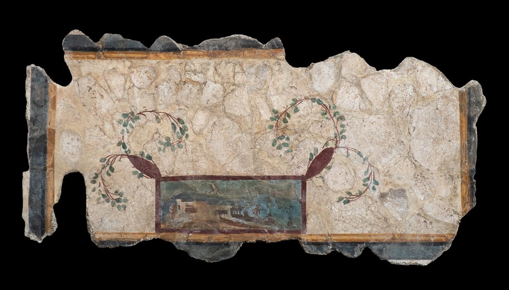
Pliny the Elder writes extensively about colour in his Natural History, its sources, production, and uses. A paint shop in Pompeii had no fewer than 29 different pigments on offer and the frescoes that have survived to us in Pompeii, Herculaneum and the surrounding Vesuvian countryside have given us a glimpse of the extraordinary wall paintings which must have adorned private homes and public spaces throughout the Roman world.
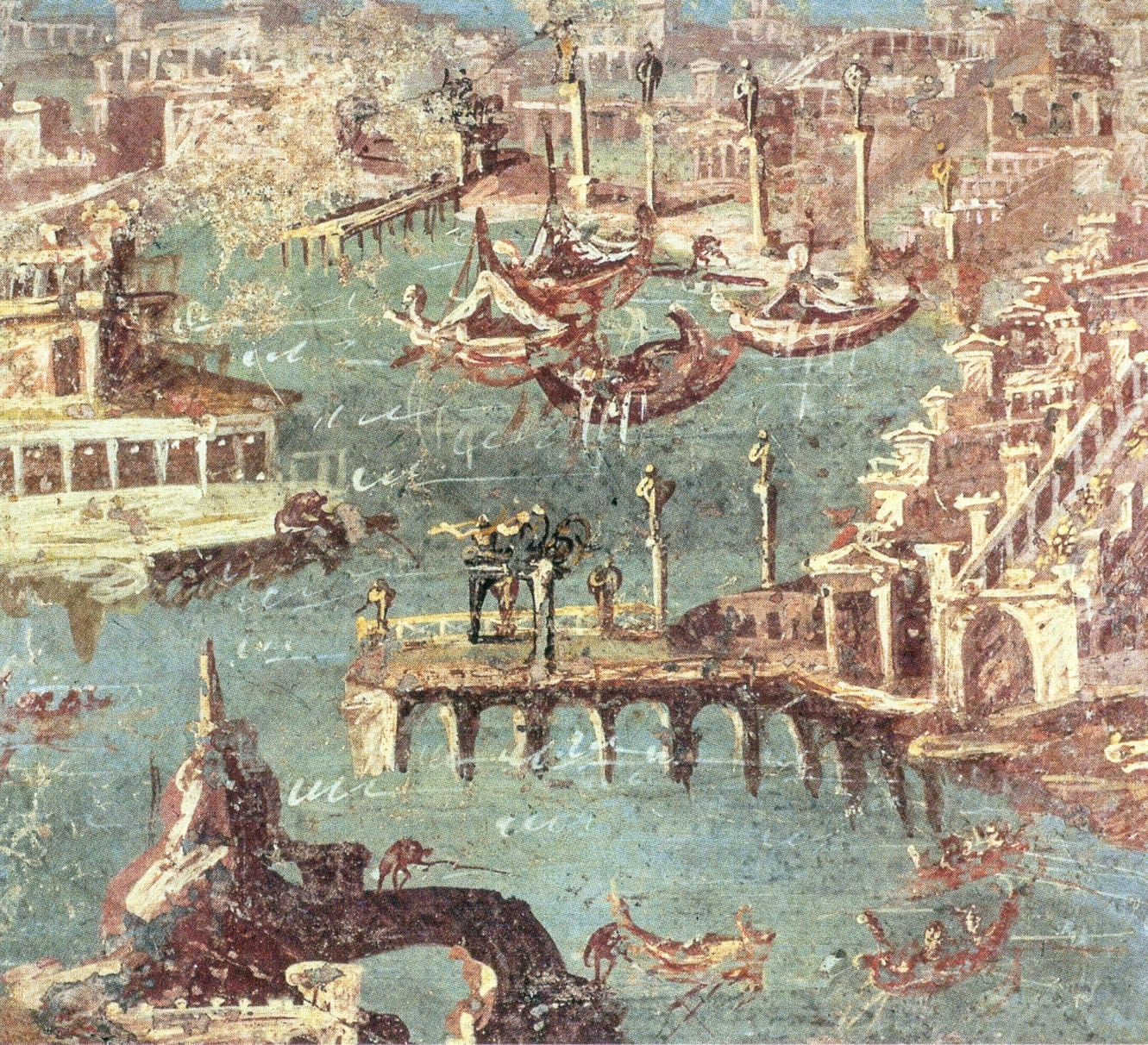
National Archaeological Museum. Naples. Italy
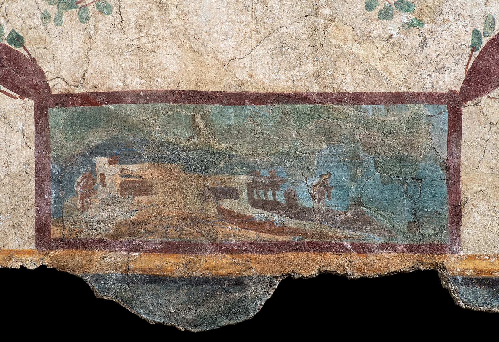
The warm red frame defines the space of the seaside landscape, where two figures inhabit a colonnaded landscape. The sky against which they are set is another extraordinary blue, this one paler and sun kissed. It is most likely Egyptian blue, or blue frit. The colour had been in production since 2500 BC, and the Greeks and the Romans were both known to have imported it from Egypt. Made from one part calcium oxide, one part copper oxide and four parts quartz fired together in a kiln to a temperature of 800 – 900 degrees Celsius, the result is an opaque, brittle blue material. Ground into a powder, it is the oldest known synthetic pigment, and a lovely warm cerulean.
Third Intermediate Period, circa 1070 - 664 BC
However complex the chemistry, the ancients did not understand colour in the way that we do. This can be seen in the nomenclature that persisted into the Middle Ages, through the Renaissance and into the 17th century – colours are named by the materials that create them, or the places from which the materials came, not by essential terms. A fact that has created no shortage of confusion to later students of the chromatic arts and led to the conflation of red and green, and yellow and blue, however unlikely that may seem. We take for granted our hues that have no dependence on context.
Despite the Greek predilection for idealisation and intellectual abstraction, they did not have the benefit of colour absolutes. Red could be eruthos, phoinikos, or porphuros. Imagine scarlet, crimson, and burgundy, but without the assistance of the umbrella term red. They had no concept of primary colours, nor did they have the benefit of Newton’s rainbow to help them rationalise the visible spectrum. For the Greeks, and the Romans after them, colour (chroma) lay on a scale between light and dark, and qualities like lustre and brilliance along with hue were valid discriminators. A most sensible notion, for surely matte black and glossy black are so fundamentally different they deserve to be called by different names. And in this light, Homer’s description of the sea as ‘wine-dark’, is perhaps not so obscure nor indeed so poetic.
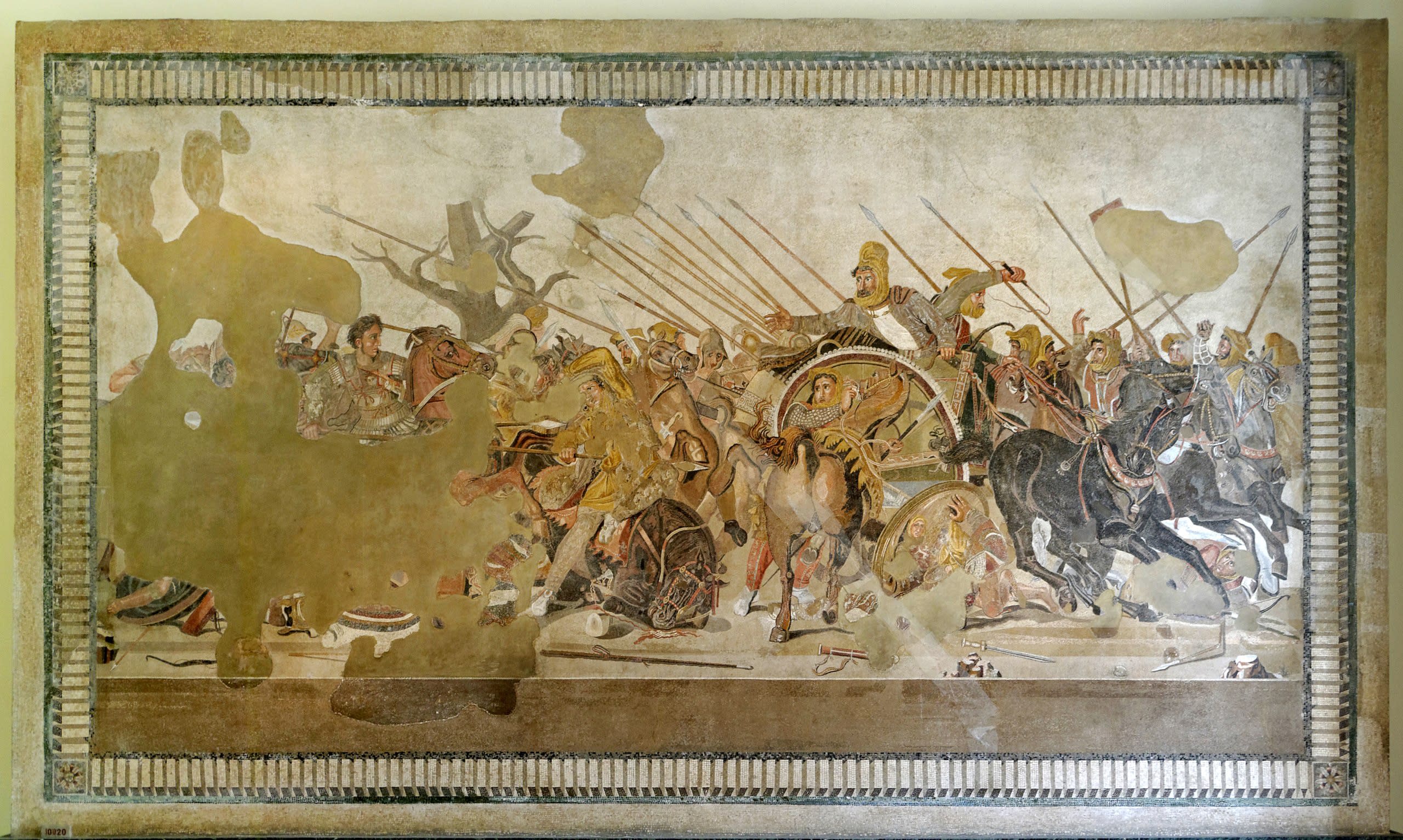
Circa 100 BC
National Archaeological Museum. Naples. Italy
The four-colour scheme may have been a practical choice by artists, rather than one that speaks to lofty theoretical ideals, and not a subject of particular interest or understanding to scholars and philosophers of the time who immortalised that paucity of palette for centuries to follow. The want of practical knowledge amongst these learned men cannot be disputed – Democritus proclaimed that pale green could be mixed from red and white, while Plato asserted it could be created from ‘flame colour’ and black. Still other philosophers (wisely?) avoided such technical advice altogether and advised against colour mixing full stop. In On Colour, Aristotle cautions against mixing pigments likening it to a ‘passing away’, while Plutarch says mixing produces ‘conflict.’ It is also worth noting that the four-colour approach to painting may have been embraced by philosophers as it fit quite nicely with Empedocles’s theory of the four elements – earth (red), air (white), fire (yellow), and water (black). Greek artists began painting naturalistically and three dimensionally in the 5th century BC. With the gentle earth tones then available to them, they were able to create the effects of the light and shadow effectively. During the Hellenistic expansion new, exotic colours became available, indigo and cinnabar among them, and the integration of these vibrant hues into the painted illusion disrupted the natural effect of the austere four-colour palette the artists had mastered. So what began as a technical necessity based on the materials available with time became an aesthetic choice supported by the philosophy that followed.
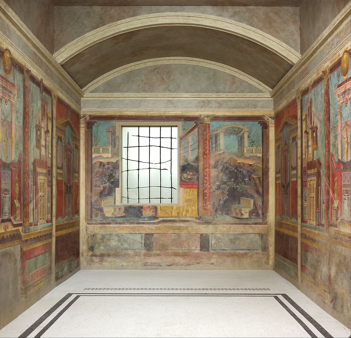
The Metropolitan Museum of Art, New York, inv. no. 03.14.13a–g